Math – Data & Graphing
This was a unit I did during my 4 week practicum in a Grade 4/5 class on Haida Gwaii. I was drawn to this part of the curriculum, because I am not very confident in my abilities to teach math YET. I felt that data and graphing was a topic that would be the most accessible for me, thus being a topic that I could convey clearly to the learners. This unit combines experiential, land-based, project-based, and student-led learning. Each section will go through the lessons taught and resources I made associated with that lesson followed by any reflections I had afterwards.
Lesson 1 – What is Data? What is a Graph?
Prior to teaching during my practicum, I spent the week before observing my class and my Coaching Teachers’ teaching style. For math she would screen share an iPad onto the SmartBoard and teach the lessons from there. I was interested in trying this approach because it was something that the learners would be familiar with and the style aligned with my personal learning styles; I loved that this style of teaching was very discussion-based, and allowed for me to draw and provide a relevant and collaborative visual in real-time catered to the learners in the room.
The software I used on my iPad to draw these visuals up is called Notability. I find it very user-friendly and it allows for me to save the notes and easily print them off to give to the learners to refer back to at any point throughout the unit. Below is a sample copy with the notes we created as a class AND a blank copy available for download.
I began the lesson with asking students what they know or what comes to mind about data and graphing. to start off the unit. We went through in order would always start off with talking about what we noticed and then get into the different types of graphs (line graphs, pie graphs, and bar graphs), different elements of the graph (y axis, x axis, title), and what the graph is showing us. Everything that is written on this example was what the students were noticing. This lesson was for the most part student led. I would provide them with definitions such as the x-axis and y-axis, but they told me the purpose of each aspect and what it was measuring; I just recorded what they were saying. Everything else was determined by the students collaboratively.
Wherever natural, I like to finish off my opening lessons with asking the learners “What do we want to learn more about?” This gives me the opportunity to tweak future lessons to cater to what students are wanting to learn and then I can adapt accordingly.
The graphs included in these visuals are from the internet. I did not create the graphs included in this template.
Reflection: I started by asking students “What is data and what is a graph?” The students had no idea what I was talking about. We continued on with the lesson and students got a proficient understanding of what data and graphing was, but this would have been a good foundation to provided the learners with right off the bat. My Coaching Teacher recommended being very authentic with the learners and going back to add definitions for both data and graphing with the class which we did during the following lesson. I really enjoyed this style of teaching and would continue this going forward.
Lesson 2 & 3 – Jellybean Graphing
During our first semester, one of our instructors shared with us a Jelly Bean Graphing activity. I was given permission from her to use this activity during my practicum. For this activity, students are given 36 jellybeans they must count and graph. These are the steps we followed in this class:
1.) Count up jellybeans and create a fraction to represent the certain color in relation to the total amount of jellybeans
2.) Create a bar graph to represent each color of jellybean. (This step requires students to use one-to-one correspondence)
3.) Cut out the bar graph and tape together to create one long strip .
4.) Create a circle with the long strip and line up the lines with circle provided. Color in to create a pie graph to represent the jellybeans.
Reflection: The students were really engaged with this activity. The experiential aspect was a great entrance point for the learners. I frontloaded and explained the booklet and each part of the activity. If I were to teach this lesson again I would try pulling it up on my iPad and walking students through each portion of the activity one at a time. This may be easier to ensure fast finishers are still given an opportunity to extend while making it more sustainable for me as a teacher to give the same instructions less.
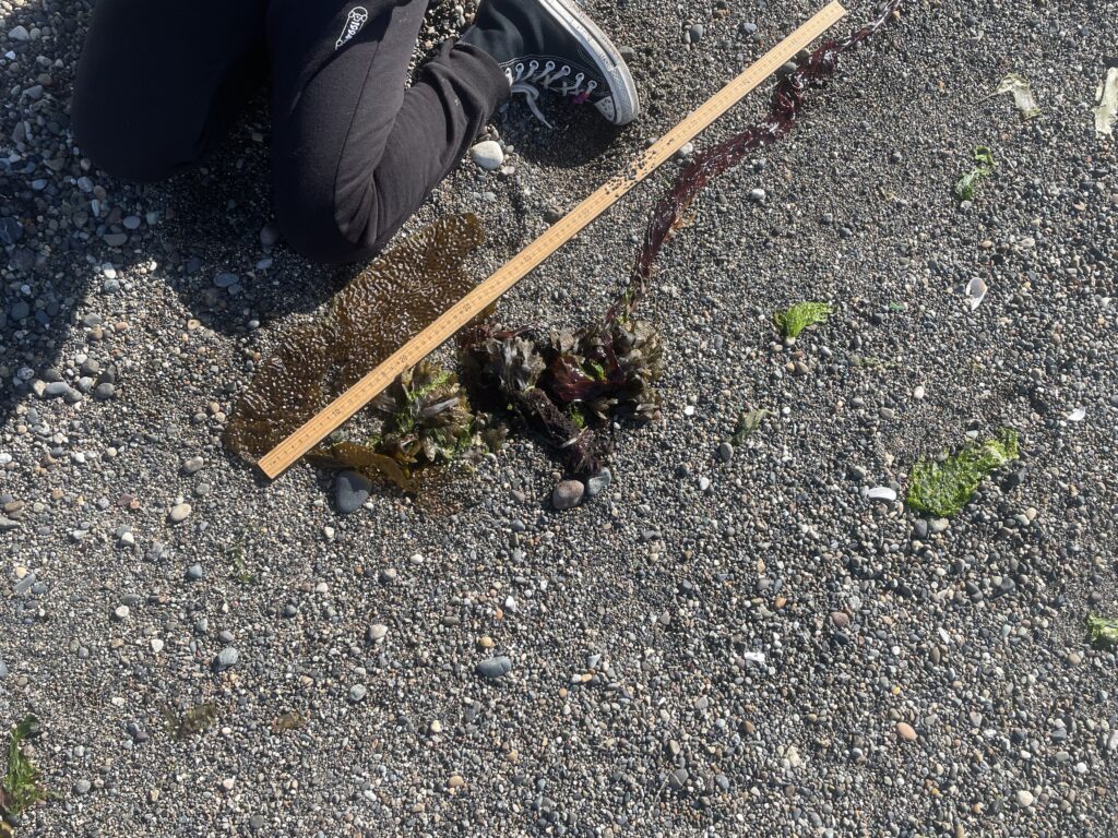
Lesson 4 – Seaweed Measuring and Graphing
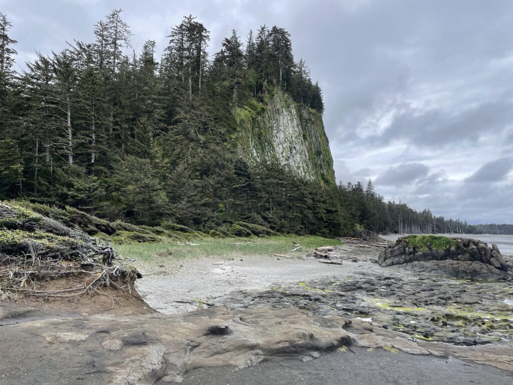
I wanted to bring a land-based element to this unit. May is the month of gathering and students were doing a lot of work with seaweed. We went seaweed picking and learned about different types of seaweed and their traditional uses from an Elder. To relate this to data and graphing we went out and measured seaweed to graph. The learned target was for students to use many-to-one correspondence as they would not be able to fit their data on regular graph paper using one-to-one correspondence.
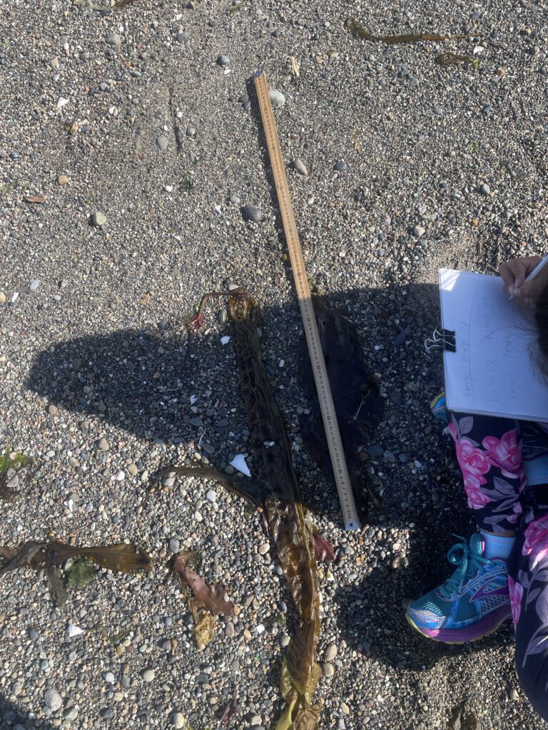
Students were required to find a minimum of 3 different types of seaweed, record their measurements, and come up with a many-to-one correspondence to represent the seaweed on a completed bar graph. There were lots of opportunities for extension with this activity, especially when students started looking at all of the different types of seaweed and how long they were. They also love their time at the beach across from the school so this was a great land-based activity for them to engage with.

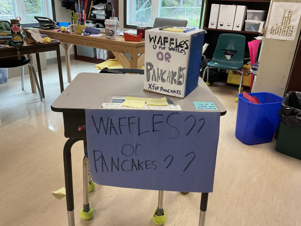
Lesson 5 – Prepping for Survey Day
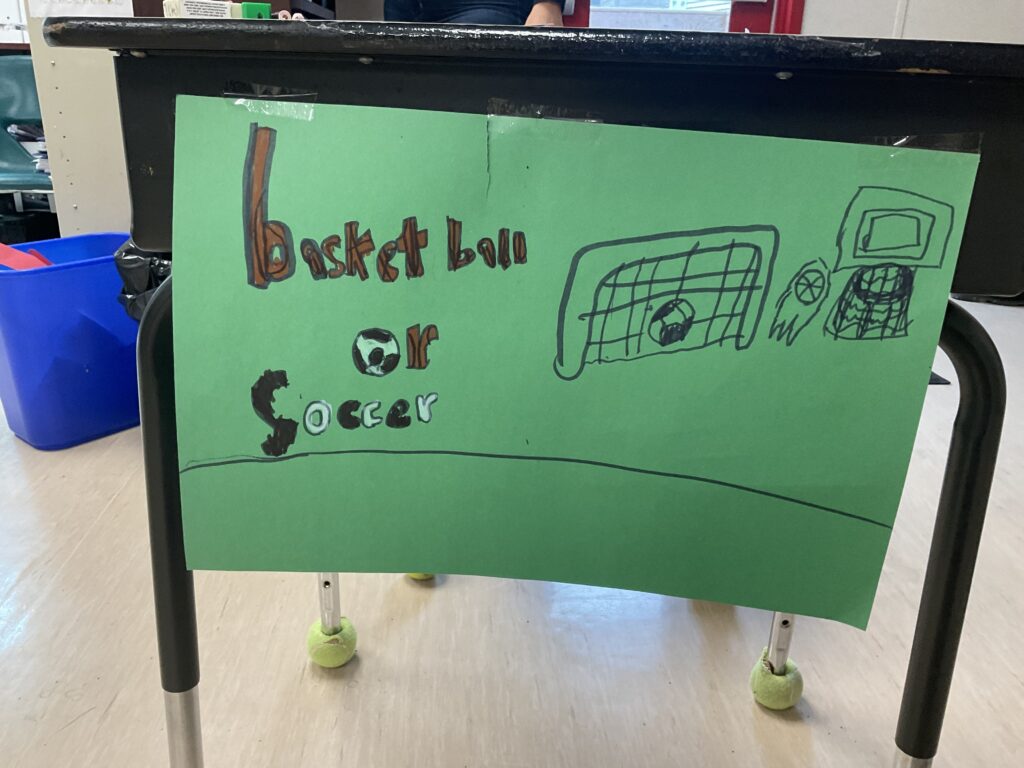
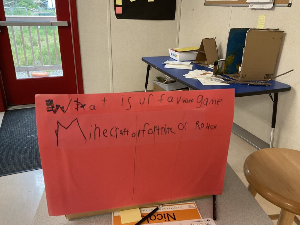
I wanted to bring in an activity that I did as a Grade 7 student in regard to graphing that I still remember to this day and found it really engaging. Students provide participants with a question, gather the data, and demonstrate their findings on a graph of their choice. The questions and presentations were decided upon by the students. Students had the option of working individually or in partners, but they needed to provide individual graphs if they were working together. Students were allowed to provide options with their question or leave it open ended. Everyone chose to provide their participants with options as it requires less graphing.
Some of the questions students brainstormed included the following:
Which candy do you prefer?
What is your favorite soda?
What is your favorite video game?
What is your favorite food? Would you rather pizza or burgers?
What is your favorite animal?
What is your favorite season?
During our brainstorming session we spent lots of time talking about how we would gather our information, how we would present our learning, and if we had a really specific question, how we could make that accessible to the audience. For example, one student wanted to ask “What is your favorite Fortnite Skin?” This is a great question, but not everyone would know the different types of Fortnite Skins. We mentioned that he could have pictures printed for his audience to look at before they vote.
Students spent the rest of this lesson brainstorming and building their visual component for the voters.
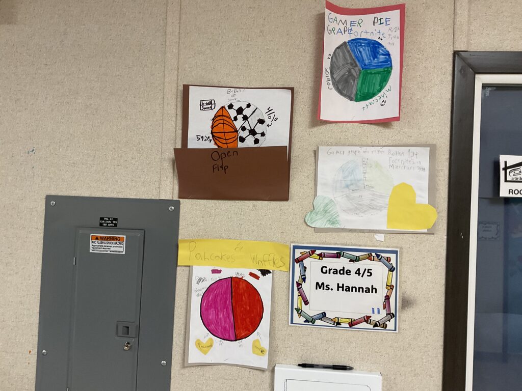
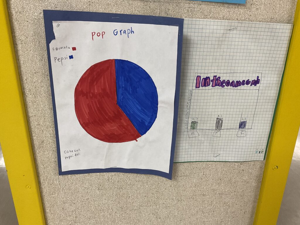
Lesson 6 – Survey Day
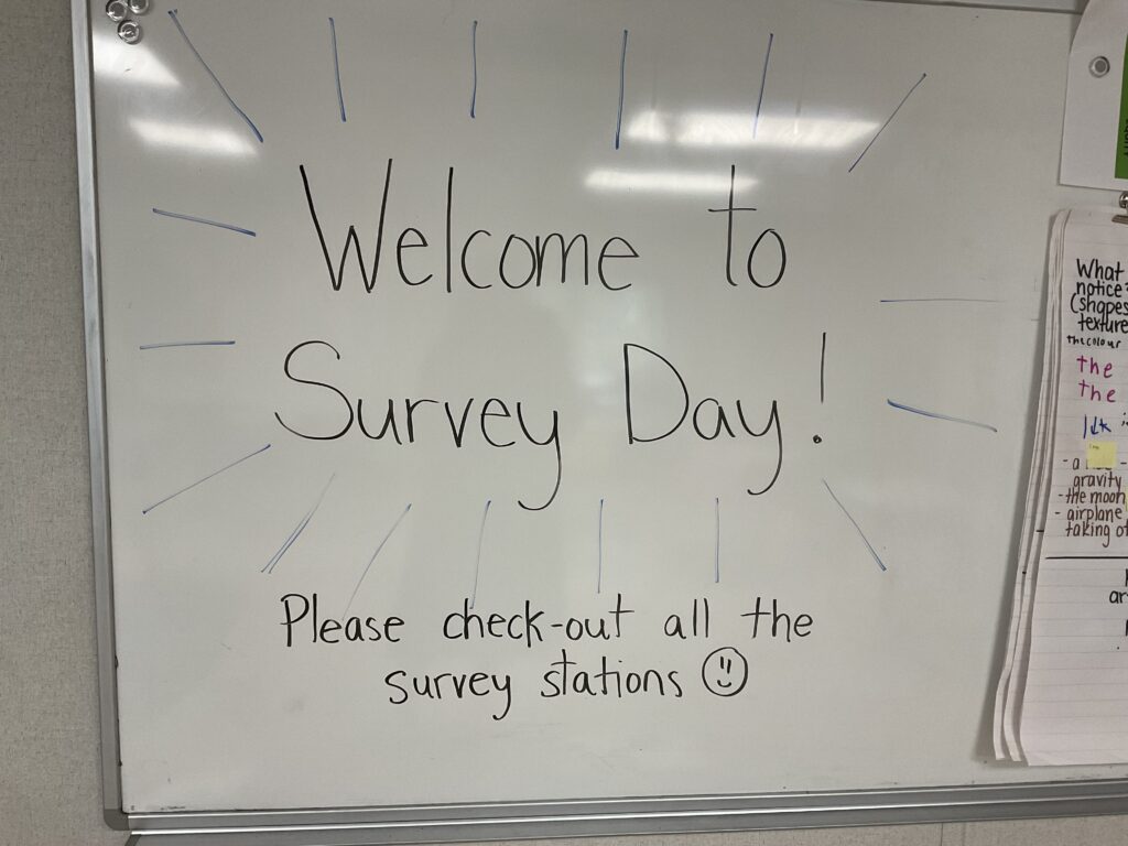
How survey day works is we invited classes and students’ families in to rotate around the room and answer each survey. We had about 2 other classes in at a time rotating with breaks in between and we had a good range of classes going from Kindergarten to Grade 6 and many of the other teachers from around the school participated as well. It was a great day, the students loved to share their work with their peers around the school as well as the family members that were able to come in. We went around and answered each others surveys as well in between visits from other classes.
Lesson 7 – Graphing the Data (Unit Wrap Up)
Students were really excited to count up their results and get to graphing. As students had exposure to line graphs, bar graphs, and pie graphs, I gave students the option to use any of those three graphs that they learned about. Lots of students had chosen to represent their data on a pie graph. On the very first day when I asked students what they want to learn more about, they were interested in how to make a pie graph and how to determine percentages.
I was not really sure how to make a pie graph myself without the use of tech, so this was a great opportunity for me as an educator to be authentic and learn how to do this alongside my students to give them the tools they needed to demonstrate their learning in their chosen manor. They did an amazing job of their graphs and were excited to post the results for the rest of the school to see.
This concluded the page on my Data and Graphing mini unit created for my 490 Formative Practicum. Haaw’aa for reading and I hope you found this helpful.